Our New Name
We believe that our new name, KH Neochem, makes a clear statement of what we are and what we will become. First, we are an international chemical manufacturer built on a long, successful tradition and well-earned reputation for innovation and advanced technology, and had been better known by the nickname of "KH Chemical". Equally important, our name also projects a sense of newness and anticipation for the global expansion we are determined to achieve in the future.
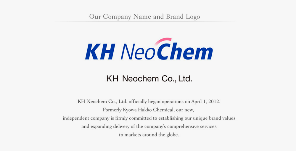
Our New Logo
KH Neochem’s logo reflects the management ideals "Building on our solid foundation of chemical manufacturing knowledge and technology, KH Neochem is committed to providing a stable supply of valuable materials and services, and as a result, contribute to the enrichment of the lives of people around the world."
Our new logo is a further graphic representation of that ideal. The design encompasses several important concepts:
- The forward-moving characters represent our driving force, continuous development efforts and determination to advance the growth of the industry.
- Chemical reaction and creation of added value are indicated by the sweeping arc above our name.
- Our color scheme is also significant. The blue stands for trust, good faith, intelligence, safety and hope for the future. The pink accents, reminiscent of cherry blossoms, symbolize our Japanese heritage while also communicating a sense of peacefulness, kindness, warmth, and Kurashi Hanayagu, defined as brightening peoples’ lives that you can see in the new company name concept page.
We invite your inquiries and look forward to a long and prosperous business relationship.